Oopsie!
Dear readers–as you can see, this blog has had a radical makeover in the past day. We’re working on fixing the glitches as well as personalizing the header to make it look more like Historiann rather than a generic WordPress blog.
Please be patient with me!

yeay!
LikeLike
Oh, exciting! A New Look!
LikeLike
Thanks! We’re working on it. WordPress is working to fix the missing photos now, and I’ll be making gradual improvements and updates over the next few weeks.
LikeLike
Hooray! Welcome (?) to WordPress!
LikeLike
Thanks! But I’ve always been on WP. This is my first time buying server space here, though–my traffic is such that it’s breaking my blogmeister’s donated server space, so it’s time for me to pay my own freight. Finally!
LikeLike
It’s like buying new shoes… but for your blog!
LikeLike
HA-ha. Love it. (Although I’d never walk around in 7 year old shoes, but it took me all this time to update the blog?)
I still like the newspaper-like blog layout. I hate the moving swipey pictures thing that so many blog formats are pushing. Why, if you have useful information and real content to share?
LikeLike
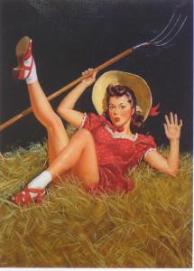
I am surprised by the design choice in the header to obscure the cowgirl’s face with the title but show her cleavage…
LikeLike
Believe it or not, most of the cleavage/flesh has been edited out! I kind of like the “everywoman” aspect of the black box over the face.
For a long, long time I refused to post any photos of myself on the internets in general and esp. on this blog in particular. I now have a “real me” photo on my Twitter page, but I still like the cowgirls & like the mystery that obscuring their faces preserves. (If you look carefully, as you scroll down from the banner to the blog content itself, the box over the face fades & you can see the whole image better.)
LikeLike
I like it! I’m especially glad you’ve retained the chronological format. (We)b*logs* are meant to be chronological. I hate it when I’m confronted with a bunch of little boxes and can’t figure out which the most recent post is (though I like the content of several blogs that are formatted that way nonetheless).
I also hate the moving-image-in-the middle thing.
I do, however, own (and wear) older-than-7-years-old shoes. When I don’t, it’s only because I wore them out before then (or because they were never comfortable).
P.S. Don’t know what you’re doing for hosting, but I’m using reclaim hosting (a service created by and for academic types), and like it. It’s also cheap, and makes it easy to install wordpress Maybe a bit too late to offer that advice, though!
LikeLike
Thanks, CC. This format seems too space-y and too much scrolling down compared to my old format, but I get it that the blog needs to work on multiple platforms. As a historian, I abs. agree with you about the importance of chronology in orienting myself on a blog!
I bought a year of premium hosting from WordPress–a customer service tech person there figured out how to get my images to show in the new format, which is awesome, so it’s worth every penny so far! (Also: I’ve been coasting on donated server space until now, so it’s time for me to pay up.)
LikeLike
Agree on the too-much-white-space/scrolling thing, but “responsive” (I think that’s the word for working on multiple platforms) is definitely the way to go these days, and that involves some compromises.
LikeLike
I hate this!! Why did you fucke around with your blogge??? It looked great before!! WAAH!!!!
LikeLike
Yikes. I go away for a bit, and everything’s changed. The old manse is all gussied up, the horses have moved, and the hay barn has way more white space.
I kind of like it better than the old design, but I also feel where Comradde PP is coming from. The homestead ain’t the same. Waah.
LikeLike
Well, friends: so long as you wipe your boots and use the spittoon, you’ll be welcome here any time.
Yes, way too much white space in the barn. I like the possibilities for posting visual material, but this blog has also been about the crunchy, nutritious goodness of the writing.
LikeLike
What do you think of the ochre background with adobe accents? (It does something about the masses of white space, anyway!) I think it looks better than the stark white background, but I also want to stick with a lighter background/darker type. (I find reading light type on a darker background irritating.)
The cowgirls show up nicely next to the new background, I think.
LikeLike
Yes, like the color. The spacing is still a bit much.
LikeLike
Inorite? It’s like all of a sudden I started writing this blog in fat crayons on that lined paper from elementary school like this: https://www.pinterest.com/pin/8514686768760306/
LikeLike
Just stopping by (or moseying by?) to say the new format looks great & colorful!
LikeLike
Hey, Undine! I’ve been thinking about you. Can you post as Undine here?
LikeLike
So far, so good on WordPress posting!
LikeLike